Early Development
BRIEF:
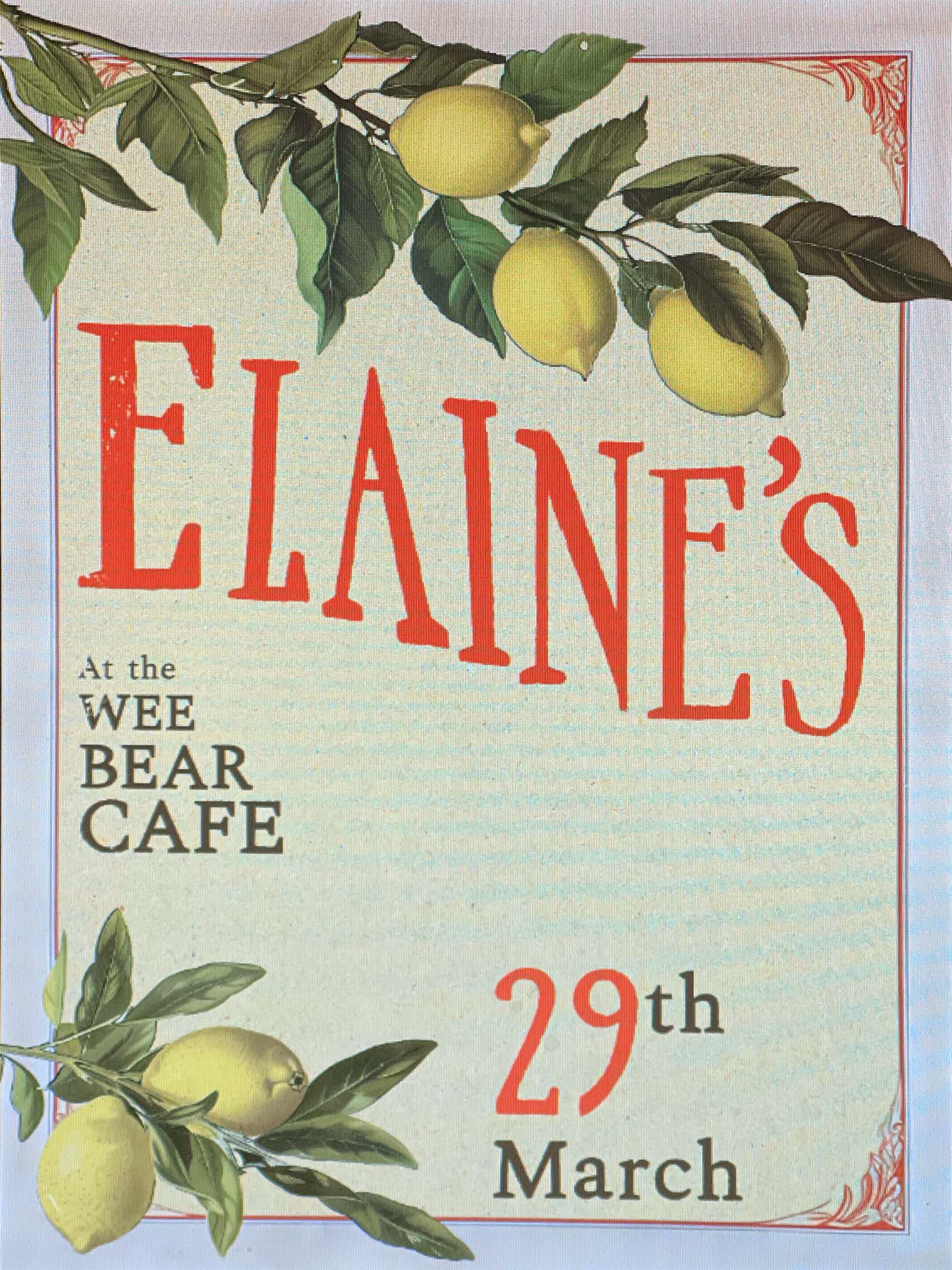
The client wanted a classy, early 1900s style poster for a restaurant collaboration. The menu was designed around local produce and classic, hearty dishes so the designs should reflect this.
PROBLEMS:
- How to achieve an authentic vintage look with modern digital methods
- How to use a colour palette and focal point to create an eye catching poster

SUCCESSES:
- An eye catching focal point of a lemon branch against the dark blue catches the eye and conveys the freshness of the ingredients
- Use of borders and patterns add an extra layer of depth
- Custom 'ELAINE'S' vintage type paired with Cooper Black for regular text works well to sell the vintage feel
REFLECTIONS:
- Use of overlaying textures, imperfections and faded colours achieved the desired 'Vintage' look
- AI was used as a filter to convert my digital painting of lemons to a more grainy, stylised, vintage look
- Colour palette could be considered too varied, perhaps the 'ELAINE'S' text could have conformed to either green or yellow

BRIEF:
The client wanted a rustic, traditional feeling menu to fit the poster and general desired aesthetic.
They wanted a homely and humble feel to the menu to mirror the style of cooking.
REFLECTIONS:
- I had been given an existing pen and ink logo, so recreated this pen and ink vibe with the logo of the collaborating café
- A typewriter style font felt personal, vintage and home-like and a hand-drawn border supported this
- Cream and brown created an understated, classy colour palette