BRIEF:
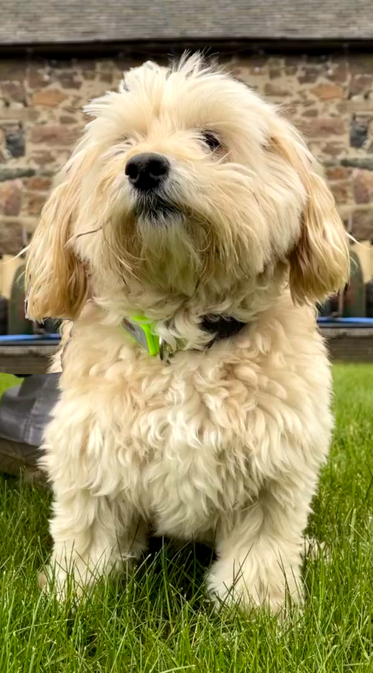
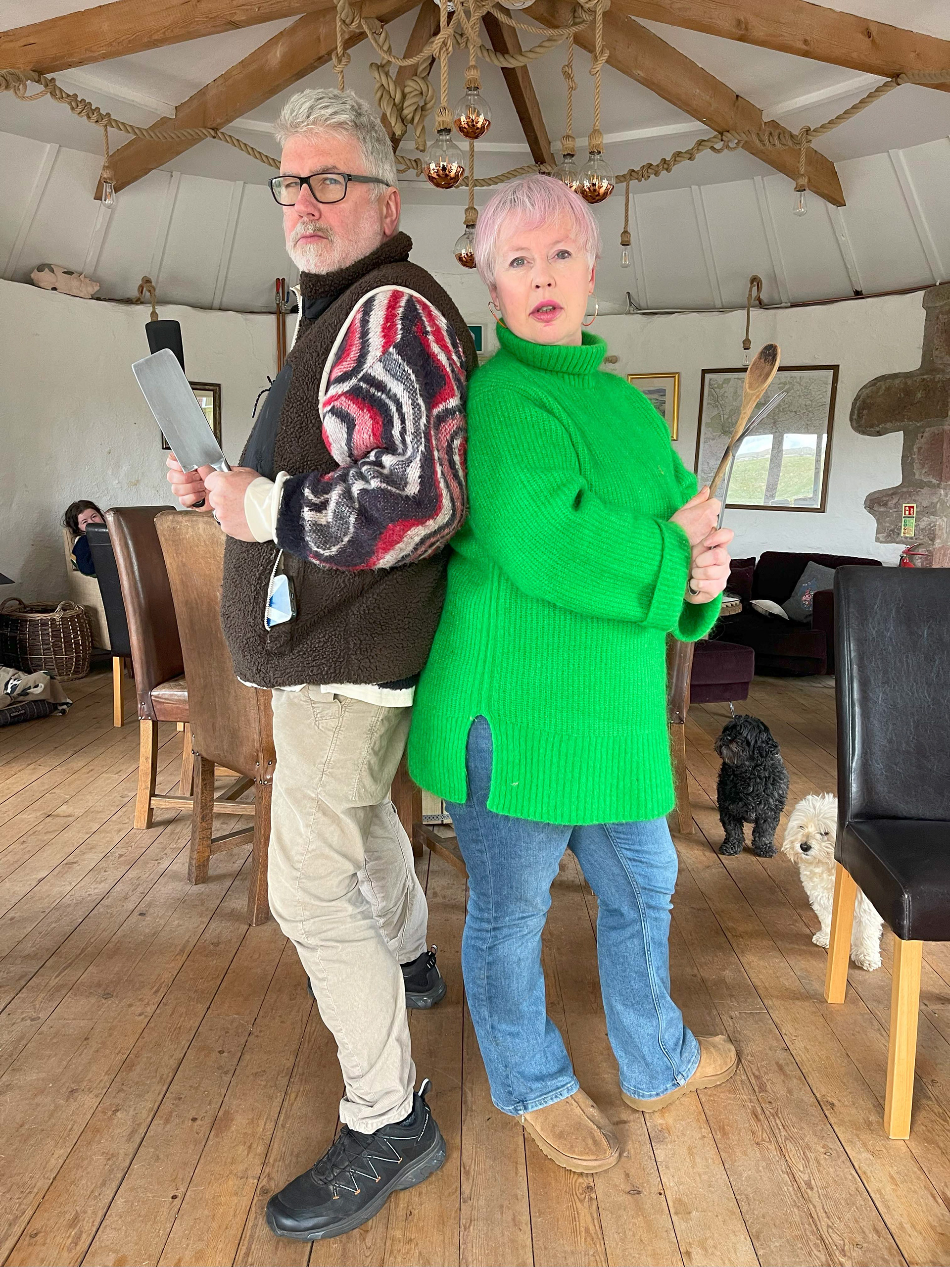
Create a playful, movie style poster for a pop-up taco night in a restaurant. Include the café dog 'Bear' and the owners.
PROBLEMS:
- Lack of a professional camera
- How to translate a 'fun' vibe into an easily readable poster
- How to conform with the brand
SUCCESSES:
- The juxtaposition of the clean and playful digital linework with the photography created the desired fun atmosphere
- The photo assets were cleaned up in Photoshop - the colour of the fur and clothes were both altered for readability and cleanliness
- A very pleasing composition, a parody of the classic villain movie poster
- Bold, playful, readable text
- The colour choices of the yellow taco imagery atop the purple background make the heading pop
BRIEF:
Full creative liberty with the inclusion of Asian imagery
PROBLEMS:
Being new to posters meant researching what makes a poster's composition and colours eye catching
SUCCESSES:
- Continuing the playful vibe with fun, colourful imagery
- Having the imagery being more eye catching than the text, both colour-wise and compositionally - this made for a more eye catching poster
- I used a paper texture as it fit the design direction and was also being printed
- Creating depth by lightening distant layers helped accentuate the focal point
- A border helps provide spacing and accentuates the artwork
BRIEF:
I was given creative liberty to create a fun, tapas themed poster
PROBLEMS:
- How to achieve a classy, bold and vintage look
- How to pair fonts together
- How to convey authenticity in the food with only design language
SUCCESSES:
- The bold orange border is very eye catching
- Loosely using the 60 - 30 - 10 colour ratio rule helped accentuate the red dates of the event and generally create a pleasing image
- Using imagery of Spanish architecture helps convey the authenticity of the food
- The 'postcard' feel of this poster invokes nostalgia in the viewer of perhaps an old holiday
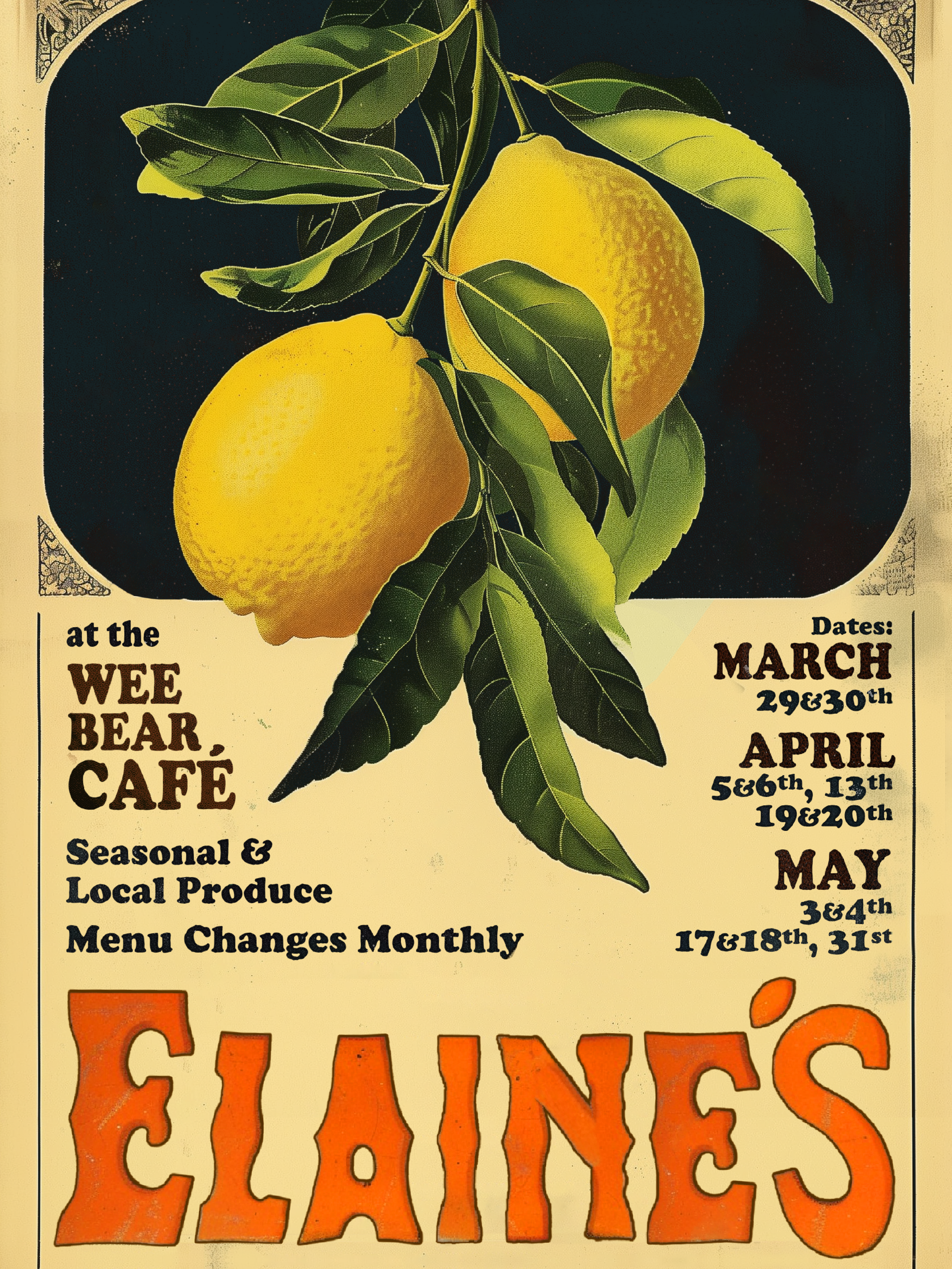
BRIEF:
Create a classy, minimalist poster for a classic small plates menu
PROBLEMS:
- How to convey text and imagery minimally
- Creating classy imagery
SUCCESSES:
- Colour choice of red on cream lends a beautiful mix of bold and subtle
- Bold border with plenty of padding and spacing helps accentuate a relatively small focal point
- Paper texture conveys a homemade, cosy vibe
- Font choice communicates a classy atmosphere
BRIEF:
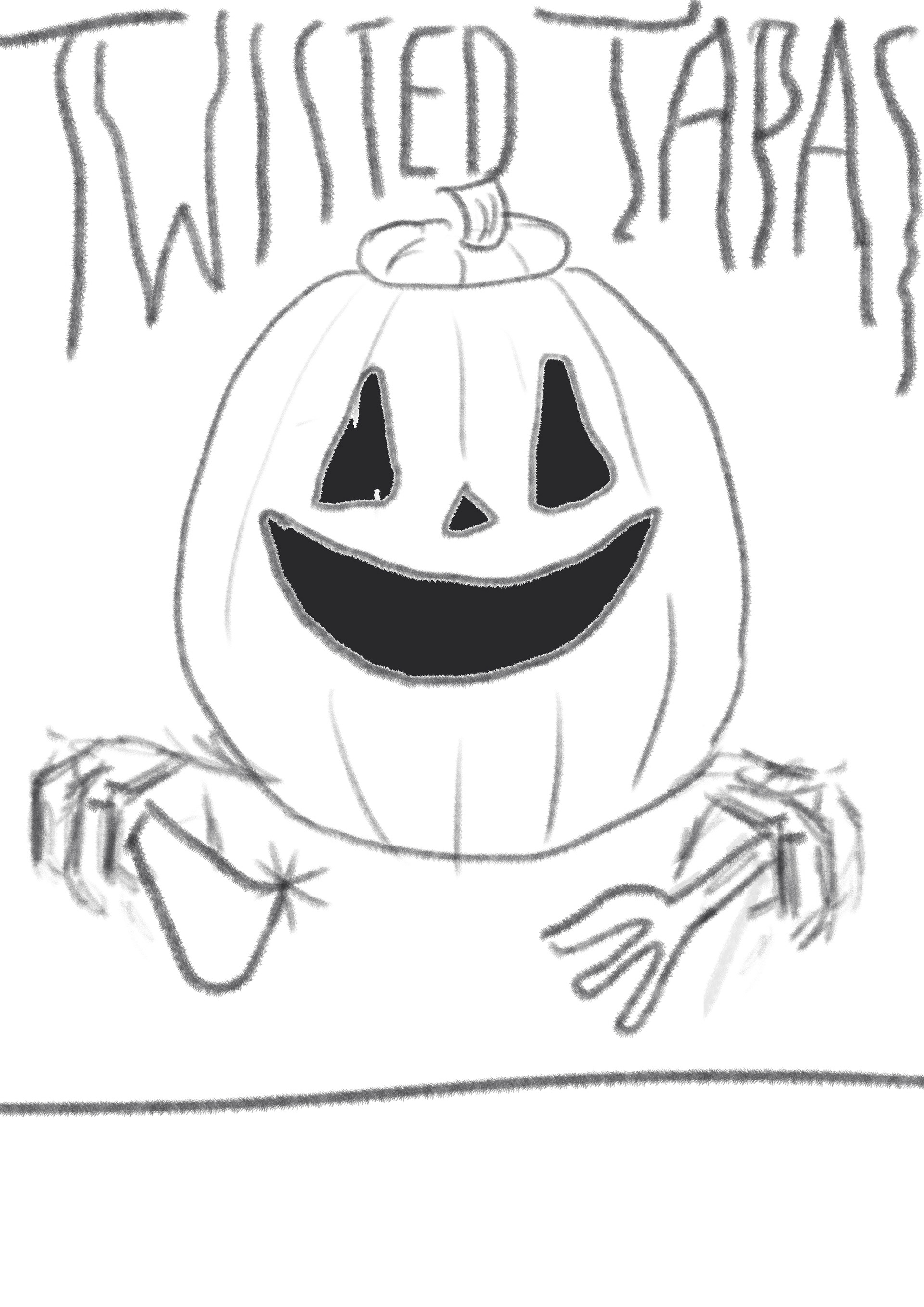
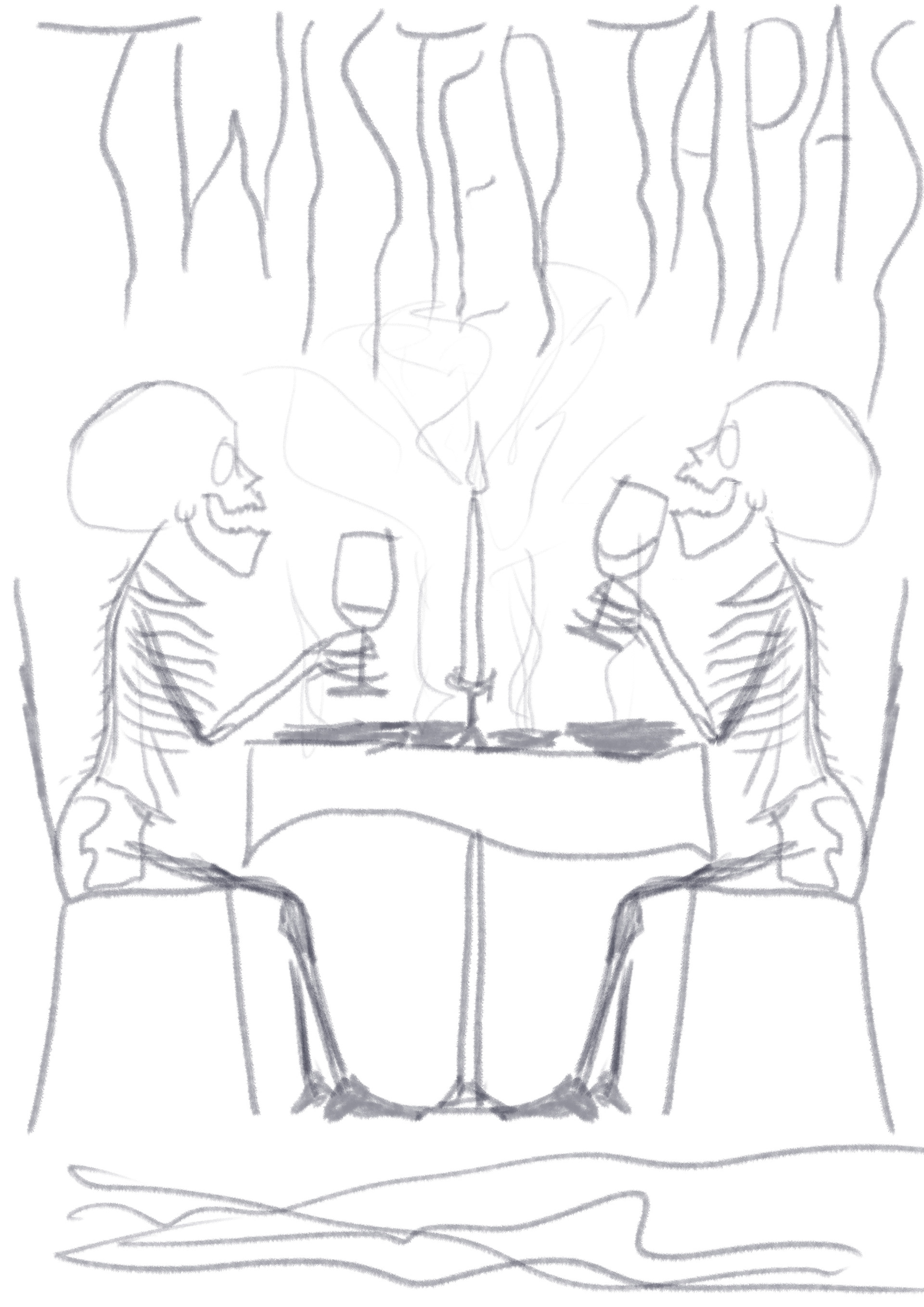
Create a Halloween themed poster (but don't make the food look bad!)

PROBLEMS:
- Conveying a scary, 'negative' vibe without creating a negative look for the restaurant's brand
SUCCESSES:
- The red, tendril-like text is bold, readable and creepy
- The skeletons are depicted laughing and drinking, circumventing the possible negative connotations
- The empty plates both make sense and avoid possible negative connotations
- Font choice conforms with the ancient, scary atmosphere of the poster
These posters contributed to a record breaking year at The Wee Bear Café, increasing table bookings, customer engagement and the aesthetic of their brand.
